Stencil, Storybook, Typescript
Embarking on my first major UI/UX project in a few years, I decided to take a few spikes into our first few sprints to get reacquainted with the Frontend Development Ecosystem. Frontend development, amongst all of the disciplines, has a reputation for moving fast, and I myself have been burned by the links of Angular 2 through 6 upgrades. In the years since I was focusing on developing user experiences, a lot has happened, new tools have overtaken old ones, and new patterns have emerged.
During my research spikes, meant to inform the technology decisions that would need to be made before breaking ground, I found 2 technologies that were net new to me and that rather impressed me: Stencil and Storybook.
Stencil, according to their website, is a toolchain for building reusable, scalable Design Systems. It is a compiler for Web Components, which I have used in the past, but have always relied on heavier libraries like Polymer to do the heavy lifting. Since my time with Polymer, the standards around web components have changed and native browser support has become much more commonplace. The result is the ability to create web components, one of the downsides is the API to do it natively is sometimes complex and not the cleanest. Stencil fixes this gap, by giving you a way of declaring your component API in typescript, and it compiles into the different ways of distributing web components.
The truly impressive thing is the framework integrations. Building as set of native web-components is nice, but being able to reuse them across frameworks like Angular and React is impressive. Back at Comcast, working in Polymer on some projects and AngularJS on others, we never dreamed of interop (partially due to browser support). But the new native web components are “just html”, which means anything that can control the DOM can interop with Stencil Components.
With Elm being all but decided on for the new project, the ability to develop styled web components that I can just use in an elm application without having to worry about styling came as a major benefit. I love Elm. It is amazing at many things. But I recently tried out Elm-CSS and was happy with how it worked on the project I used it on, but seriously doubted the scalability of it to the side of an entire application. In the past I have used SASS to build component systems and elm to laydown the styles, but there is type checking or ability to make sure the right class is applied. I have tried Elm-UI, and I think it is an amazing project, but I dont think it is production ready yet. The ability to encapsulate all of the styles and behaviors of a reusable component and just use them at the elm layer is incredibly exciting to me.
So once you have a nice library of reusable, styled, self-contained components, how do you make sure you aren’t recreating the wheel, and how do you share them with the design team and other developers to make sure everyone is speaking the same language; after all one of the purposes of building good design systems is to create a common lexicon or vocabulary between developers, designers, and users.
Enter Storybook. Storybook is a tool for developing UI Components in isolation and including documentation and examples to allow for developers to clearly communicate with each other and designers. Currently it has strong integrations with all of the major Javascript Frameworks like React, Angular, and Vue; it even has some of the more obscure ones like Svelte and Mithiril. It really provides an awesome and intuitive interface for exploring a teams Visual Vocabulary.
The drawback with Storybook is also the impetus for this post, it doesnt have a
first class integration with Stencil; yet. I have seen a few guides online for
combining the to using the @storybook/html preset; which makes sense, since
Stencil just produces self contained HTML web components. However a lot of the
guides made very little use of the storybook features and I felt there was
something missing, so I started digging into their codebases to see how I could
integrate them a little better. One of my goals was to completely the use of
Typescript during development. Having done a number of Typescript projects and
obviously being obsessed with Elm, I find it hard not to develop with at least
type hints, and developing without any type safety in mind makes me feel dirty.
So here is my findings on integrating Storybook with Stencil to maximize the use
of Typescript.
Integrating Storybook with Stencil using Typescript,
We are going to start with a sample project to build a component library with stencil and storybook.
1 | $ npm init stencil |
This command uses the create-* trick in NPM which I will be covering in a different
post. Essentially, it is building a structured folder for stencil based off of a
template and some questions you have to answer on the command line. For this
example we are going with the component project type and naming the project
sample-project.
This creates all of the structure we need and even installs all of the necessary pieces. Lets enter the repo.
1 | $ cd sample-project |
This is the initial stencil setup for component libraries. It created a starter
component for us at src/componennts/my-component.
Now to add storybook.
1 | $ npx -p @storybook/cli sb init --type html |
This uses the npx command which allows you to run node code without installing
it first. Here we are using the storybook cli to initialize a storybook with the
html preset. This command will create a stories folder and a .storybook folder
that houses the default story and the storybook config respectively. It also
install the necessary packages in your package.json.
While we are installing things, we know we want to write storybook using typescript,
but since we are already using babel for both stencil and storybook, we should
use the babel typescript compiler instead of the native one. We can do this by
adding the @babel/preset-typescript package:
1 | $ npm install @babel/preset-typescript --save-dev |
The next part is to update the stories to be colocated with the components, so
instead of in /stories they will be included with the component. It is always a
good idea for documentation to live close to code; it prevents docs from getting
out of date or worse, lying to new developers.
First we can remove the /stories directory since we wont be using it.
1 | $ rm -rf stories |
Now we update the .storybook/main.js to look in the next directory and to look
for ts or tsx files and compile them:
1 | module.exports = { |
At this point we have storybook looking for tsx files in the same directories we
develop them in, but we still need to load our component library into the browser
when storybook starts. We can do this by hooking into a few of the lifecycle parts
of storybook like .storybook/preview-head.html. This file gets loaded inside of storybook,
which allows us to use our stencil components inline.
1 | <script type="module" src="./sample-project/sample-project.esm.js"></script> |
This uses the javascript module system with a default fallback. This allows the browser to load what it needs when it needs it if it can, or download the whole thing if it can’t.
Now we need to give the storybook access to these files (which are in /dist after
building stencil). The storybook commands take a -s flag to add static files
to the storybook build. Here we will update our package.json to add these flags
to the run commands.
1 | "scripts": { |
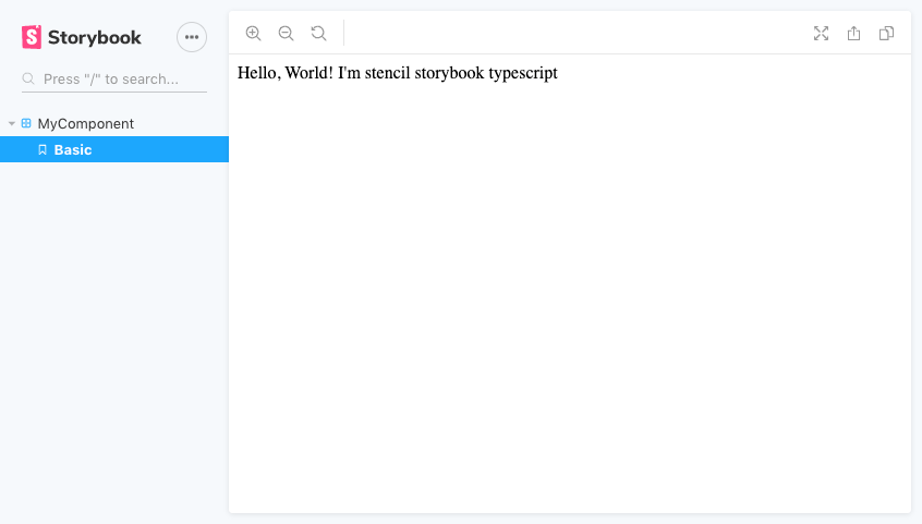
At this point we are ready to build our first story. Using the provided component,
we can create src/components/my-component/my-component.stories.tsx with the
following contents.
1 | export default { |
The default export sets the group for my component, and the rest of the exports are created as stories in that group. Here we can put different configuration options of our component on display.
Now running npm run storybook, we should be able to see our example component.
That should be enough to get up in running. I will be putting another guide
up shortly to integrate stencil’s docs with the @storybook/webcomponent preset.